
Colour Theory for Young Artists: What Etobicoke Art Students Learn First
Table of Contents
Ask a child who has never had formal art instruction to paint a sky, and they will reach for blue. Ask them to paint grass, and they will reach for green. This is not wrong — skies are blue and grass is green, approximately — but it is a limited way of seeing the world. Real skies contain lavender, rose, peach, turquoise, and grey. Real grass contains olive, ochre, rust, and slate. The child who learns to see these hidden colours is the child who, years later, produces paintings that feel alive rather than flat.
This is why colour theory sits so early in the curriculum at Muzart Music and Art School. Long before young artists tackle complex subjects or advanced media, they spend time understanding how colour actually works — how it mixes, how it behaves in light and shadow, how certain combinations feel harmonious and others feel jarring. The skills learned during these early sessions shape every piece of art a student makes afterward.
Families across Etobicoke, Toronto, and Mississauga who enrol children in our art classes see this foundation being laid quietly, through small exercises that do not look impressive in the moment but produce dramatically better work over the following months.
The Colour Wheel, Without the Mystique
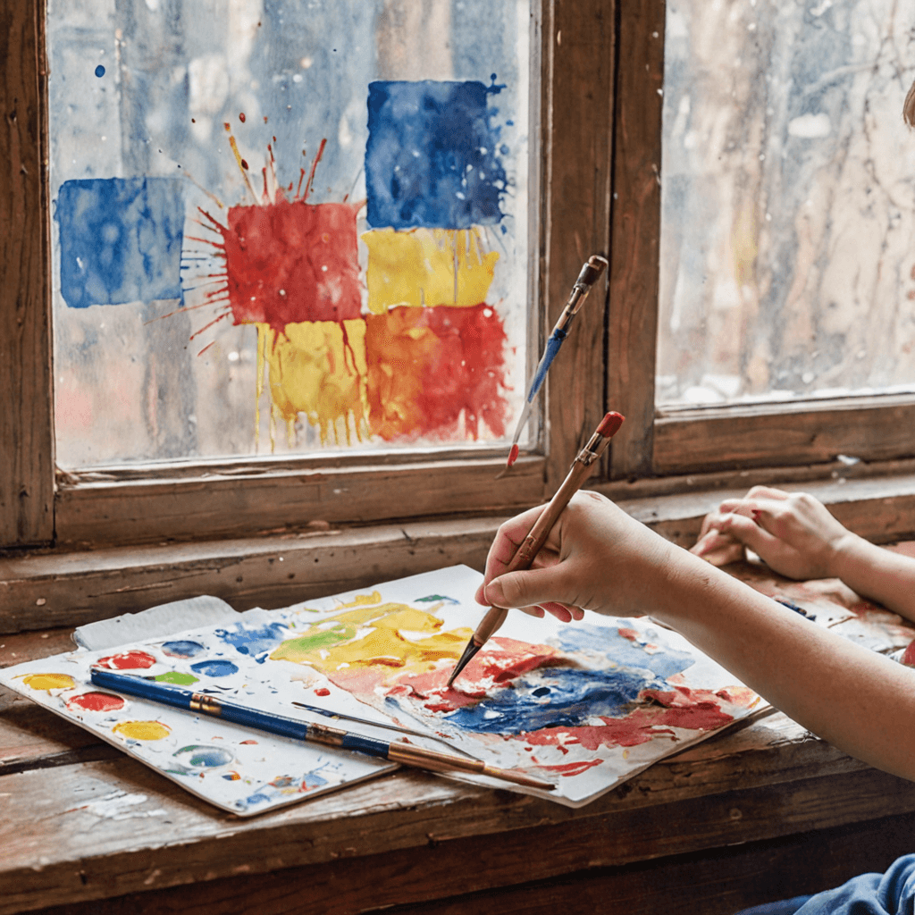
The first thing young artists learn is the basic structure of colour relationships, traditionally organized on a colour wheel. The primary colours — red, yellow, and blue — are the starting points because they cannot be created by mixing other colours. The secondary colours — orange, green, and purple — are what you get when you mix primaries in pairs. The tertiary colours fill in the spaces between, producing the full spectrum students will eventually work with.
This is familiar territory for most parents, which is why it is worth clarifying what actually gets taught. Children do not simply memorize a wheel. They discover it. Our instructors run mixing exercises where students create each colour themselves, watching red and yellow slowly become orange under their own brush. This physical experience of mixing matters enormously. A child who has mixed green from blue and yellow twenty times has a completely different relationship to the colour green than a child who only knows that green comes from a tube.
The colour wheel also introduces the idea of relationships: which colours sit next to each other (analogous), which sit across from each other (complementary), which form harmonious groupings. These concepts will matter the moment students start making compositional choices.
Warm and Cool, and Why It Changes Everything
Once the basic wheel is established, young artists learn to divide colours into warm (reds, oranges, yellows) and cool (blues, greens, violets) categories. This sounds simple, but it unlocks one of the most practically useful skills in painting: creating depth and mood through temperature rather than just through detail.
A warm colour in the foreground and a cool colour in the background will make a flat painting suddenly feel three-dimensional. A predominantly warm palette will feel cheerful, energetic, or sunlit. A predominantly cool palette will feel calm, mysterious, or moonlit. Students who understand this early gain an expressive tool they will use for the rest of their artistic lives.
Instructors in our group art classes build temperature awareness into early painting projects. Students might be asked to paint the same simple subject — a tree, a bowl of fruit, a landscape — twice, once using a warm palette and once using a cool palette. The comparison teaches more in one afternoon than any amount of lecture would.
Value: The Quiet Partner of Colour
Young artists often focus so intensely on hue (the colour itself) that they neglect value (how light or dark the colour is). This is one of the most common reasons children’s paintings can feel visually flat — every colour is applied at roughly the same middle value, so nothing stands out.
Introducing value early changes this. Students learn that adding white lightens a colour (producing a tint) and adding black darkens it (producing a shade). They experiment with what happens when a colour is pushed toward very light or very dark, and how these value shifts affect the mood and clarity of a painting.
More advanced students — and older children in particular — begin to understand that shadows are rarely just darker versions of a colour. A shadow on a red apple often contains green or purple undertones. A shadow on yellow lemon often shifts toward violet. Observing these nuanced value-and-hue shifts is what separates young artists who paint what they see from young artists who paint what they assume.
Complementary Colours: The Drama Makers
Complementary colours — red and green, blue and orange, yellow and violet — sit opposite each other on the wheel and create maximum visual contrast when placed side by side. Artists have exploited this for centuries. The bright red scarf against the green landscape. The orange sunset against the blue ocean. The yellow flower against the violet vase.
Young artists learn to use complementary contrast deliberately. A painting that feels a little dull often becomes dynamic with a small, well-placed touch of complementary colour. A portrait can come alive with a hint of green in the shadow of a red-toned face. A green landscape becomes more evocative with a small warm accent.
The other use of complementary colours is muting. Mixing complements together produces neutral greys and browns — much more beautiful and interesting than the pre-made brown or grey from a tube. Young artists who learn to mix their neutrals this way produce paintings with richer, more varied surfaces.
Colour in Observation: The Hardest Skill
The ultimate goal of colour theory education is not to paint by formula. It is to learn to see the colours that are actually there, in the real world, beyond the assumptions our brains make. This is much harder than it sounds. Our minds are extremely quick to categorize — “white house,” “green leaf,” “blue sky” — and we have to train ourselves out of these shortcuts to produce accurate, expressive paintings.
Young artists at our Etobicoke studio spend time on observation exercises that challenge these assumptions. They might be asked to paint a white sheet of paper using every colour they see on it — which turns out to include blue, yellow, grey, and pink, depending on the light. They might paint leaves and discover that “green” is actually a family of twenty different hues depending on light, shadow, and reflection.
These exercises are slow. They often feel frustrating at first because they contradict what students believe about how the world looks. But the students who stay with them come out the other side with a genuinely different kind of vision — the vision artists have been cultivating for centuries.
Materials Shape the Learning
Colour theory instruction looks different depending on the medium. Watercolour teaches colour mixing in the purest way because the transparency of the medium means colours layer and interact continuously. Acrylics allow students to experiment with opaque mixing and correction. Oil pastels and coloured pencils teach colour through layering and blending rather than physical mixing.
Young artists benefit from exposure to several media during their foundational years. Each one teaches colour differently, and the lessons reinforce each other. Students taking art lessons in Etobicoke with us typically work across at least two or three media by the end of their first year, each one deepening their colour understanding from a slightly different angle.
The Long Arc of Colour Education
Colour theory is not learned and then set aside. Students return to it again and again as their skills grow. A seven-year-old learning that red and blue make purple is at the beginning of a journey that will, by age fifteen, include nuanced discussions of colour temperature in portraiture, atmospheric colour shifts in landscapes, and colour-driven emotional choices in abstract work. The same concepts deepen over years.
Our art program for children begins with the foundational material described above and builds steadily from there. Group art classes for kids run at accessible pricing — families can request more information for current enrolment details — and are the entry point for most young artists at Muzart. Private art lessons are also available for students who need a different pace or want to focus intensively on specific skills.
Frequently Asked Questions
At what age can children start learning colour theory?
Basic colour theory concepts can be introduced as young as age 5 or 6. Young children enjoy mixing colours and discovering how primary colours combine. More sophisticated concepts — value, complementary contrast, temperature — are typically introduced around age 8 or 9, when children can hold the ideas in mind while working. The sophistication of the instruction scales with the student’s developmental readiness.
Do children learn colour theory in group classes or private lessons?
Both formats work. Group classes bring a social and comparative element that many children find motivating — watching other students’ colour choices can illuminate their own. Private lessons allow for more individualized feedback on colour decisions. We offer group art classes for children and private art lessons for all ages at our Etobicoke studio near Cloverdale Mall.
What materials does my child need for colour theory classes?
At our studio, all materials are included in the monthly program — no separate supply lists to buy. Students work with a variety of media over the course of their training, including tempera, watercolour, acrylic, coloured pencil, and oil pastel depending on the class and their level.
How long does it take for a child to develop strong colour skills?
The foundational understanding — primary and secondary colours, warm and cool, basic mixing — typically develops over the first several months of weekly instruction. Deeper skills like nuanced observation and expressive colour choice develop over years. Most students show visible improvement in their colour decisions within the first six months of consistent classes.
Can colour theory help my child with eventual portfolio preparation?
Yes, enormously. Teens who have had years of colour theory instruction arrive at portfolio preparation with a significant head start. Colour-confident portfolios stand out to evaluators because so many submitting students have weak colour skills. This is one of the quiet long-term benefits of starting art classes in childhood rather than waiting until high school.
What is the difference between colour theory and just “learning to paint”?
Colour theory is the systematic understanding of how colours work — why some combinations harmonize, how temperature affects mood, why certain choices feel balanced while others feel jarring. Learning to paint without colour theory is possible but slow; students stumble into good choices accidentally. Learning with colour theory accelerates progress and produces artists who can solve problems on purpose rather than through trial and error.
The Foundation That Supports Everything
Colour theory is not glamorous. It does not produce the dazzling finished pieces that parents often hope to see from their child’s art classes. What it does is quietly prepare the soil for every future project. Students with a strong colour foundation make better landscapes, better portraits, better portfolios, better everything, because they have the underlying language the craft is built on.
If you are considering art classes for your child in Etobicoke, the foundational work we do on colour is part of what sets our program apart. Book a trial lesson and see it in action.